Understanding Webflow Components (and Slots): A Beginner's Guide
_%20A%20Beginner%27s%20Guide.avif)
Key takeaways
- Components in Webflow let you build reusable blocks (like navbars, footers, or cards) so updates happen in one place instead of many.
- Slots act as flexible placeholders inside components - letting you change certain parts (like text or images) while keeping the overall structure consistent.
- Using components and slots keeps your site more organized, reduces repetitive work, and speeds up design and development.
- For beginners, starting with simple components (buttons, cards, CTAs) is the best way to practice before moving into more complex layouts.
- Mastering this workflow helps teams scale faster, maintain design consistency, and hand off projects more easily.
Webflow component isn’t an unfamiliar word for you if you’ve been using Webflow even for a little while. They're those handy reusable design elements that make life so much easier. But maybe you're wondering, "How do I use these in my projects properly?" or "How can I speed my development process with these components?"
That's where this guide comes in. We'll take you to the practical side of components and component slots.
In this guide, we'll explore not just the basics, but also how to use components and slots effectively in your projects. We'll keep things simple, with plenty of real-world tips to help you make the most out of these features.
Ready? Let's get started!
Understanding Webflow components and slots
Let's start with the basics. If you're completely new to components or component slots, here's a quick introduction.
What Are Components?
In Webflow, components are like reusable design elements you can create once and use across your entire website. Think of them as pre-built templates for parts of your site, like headers, footers, or card layouts. When you update a component, every instance of that component across your site updates automatically, making it a powerful tool for maintaining consistency and saving time. For instance, if you design a component for a product card, you can use it on multiple pages, ensuring a uniform look without manually replicating the design each time.
Good things that come with using components:
- Efficiency: Change the design in one place, and it reflects everywhere the component is used. Imagine making site-wide changes with just a few clicks!
- Consistency: Using components ensures a uniform design across your site.
- Scalability: Components become exceptionally handy as your site scales. They let you update or adjust things without extensive manual work.
How are Components different from classes?
Classes focus on styling. They define how individual elements or groups of elements look—think of things like color, font size, spacing, and other visual properties. When you apply a class to multiple elements, any changes to that class will update the styling of all those elements. However, classes don't control the content or structure of the elements; they only affect their appearance. That’s where components come in.
Key Differences:
- Purpose: Components are designed for reusing both design and content across your site, ensuring everything stays consistent. In contrast, classes are all about styling—they determine how things look but not what they contain.
- Updates: Updating a component changes both its design and content everywhere it's used on your site. With classes, you're only updating the styling for the elements that share that class.
- Use Case: Components are used for larger, reusable sections of your site, like navigation bars or feature cards, where you want the same content and layout to appear consistently. You use classes for styling individual elements or groups of elements, allowing you to change their appearance without affecting their content or structure.
What Are Component Slots?
Component slots take the flexibility of components to the next level. They are placeholders within a component that allows for customization while keeping the overall structure intact. Imagine slots as customizable sections in a template—these slots can hold different types of content like text, images, or videos, depending on what you need for each instance of the component.
For example, imagine you have a grid layout showing a series of cards. You can use component slots to keep the same grid structure, but easily swap out the content inside each card. In one section, the cards might display product features with images and descriptions. In another, you could use the same grid to show team members, with each card containing a photo and a short bio. This allows you to maintain a consistent layout while customizing the content as needed.
Good things that come with using component slots:
- Flexibility: Component slots let you swap out content within a consistent design, perfect for varying details while maintaining a cohesive look.
- Customization: With slots, you can personalize sections of your site, such as featuring different products or highlighting unique aspects of services, while keeping the underlying structure uniform.
Now that you understand what components and component slots are, let’s see how you can create and customize them on your website.
Creating and customizing components in Webflow
Suppose you want to add feature cards in a section of your website, highlighting 5-6 product features. Let’s see where you can use components in this case, and where slots can be more helpful.
Step-by-step guide to creating a Webflow Component
1. Designing the Base Component
Start by designing the basic layout for your feature card. This could include an icon or image, a title, a description, and a CTA button.
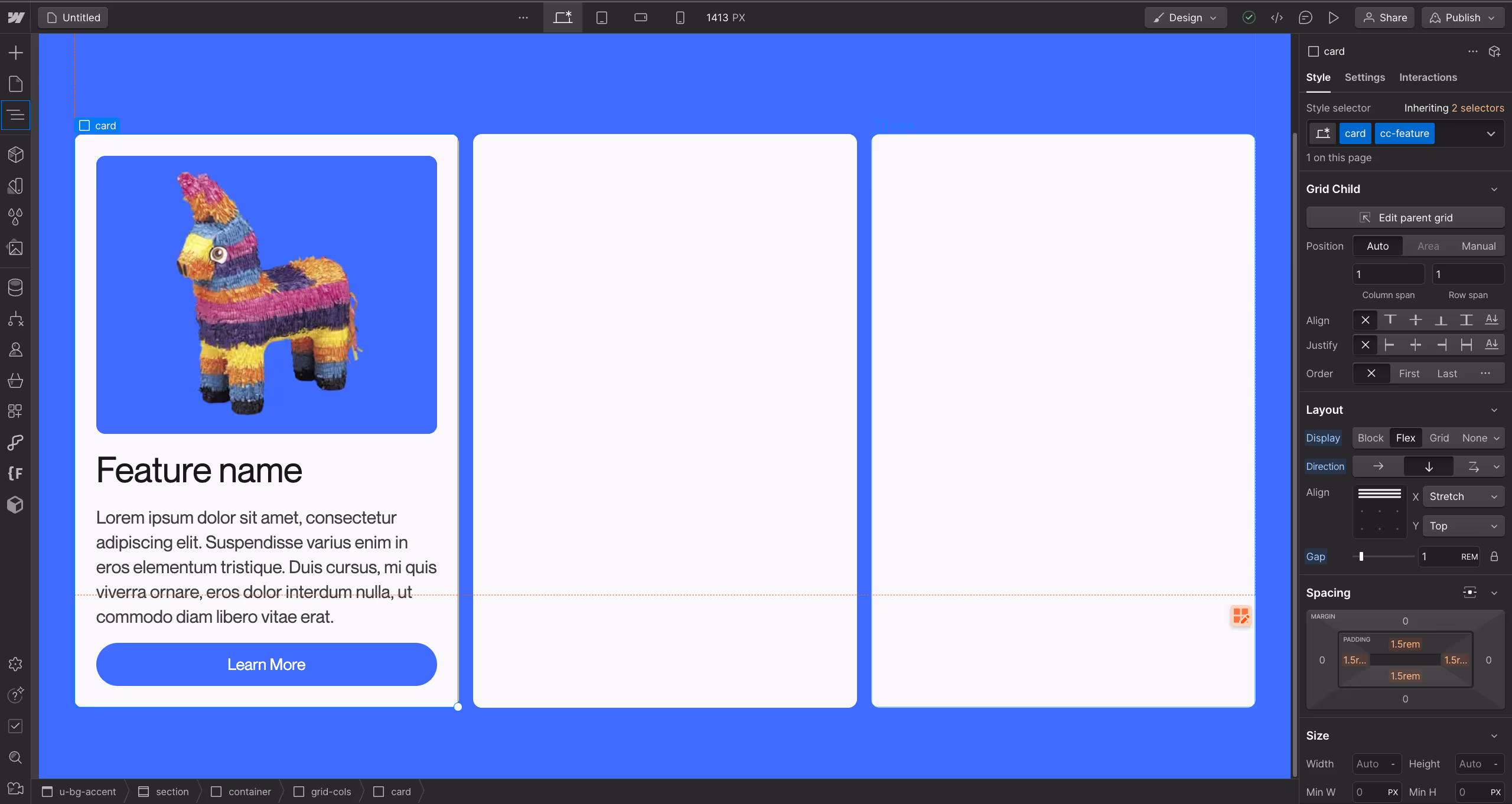
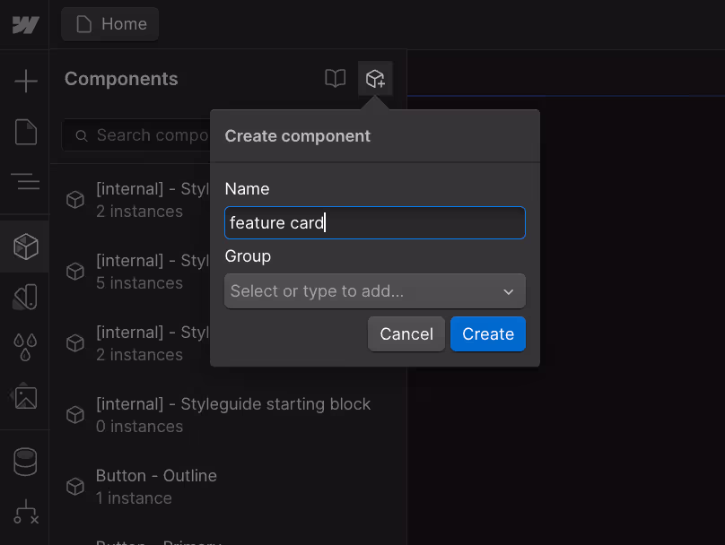
Once your design is set, select the elements that hold all these other elements, right-click and select "Create Component". Alternatively, you can press Shift+ctrl+A and a window will pop up to name your new component.
Name it something like ‘feature card’, and hit ‘create’
2. Setting Component Properties
Once you’ve created a component, we’ll define properties that allow you to customize each instance of your component. For the feature card, you might set properties for:
- Image Source: Change the icon or image for each feature.
- Title Text: Update the title for different features.
- Description Text: Modify the description to explain each feature uniquely.
- CTA Button Link: Set different URLs for the button to link to relevant pages.
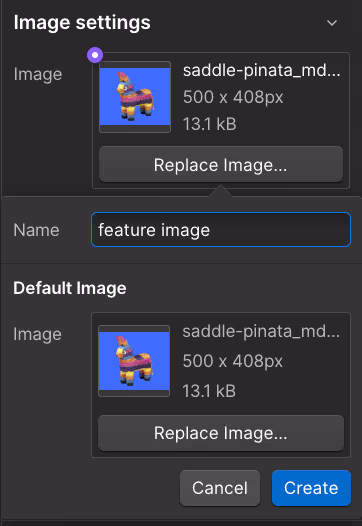
Let’s see how you can connect the image element to a property -
Step 1: Click on the image element and press ‘D’ to go to the settings panel on the right.
Step 2: Click on the purple dot on the top left of the image under image settings, then click on ‘create & connect new property.
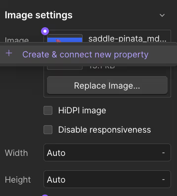
Step 3: Name your property (e.g. feature image), and hit ‘create’
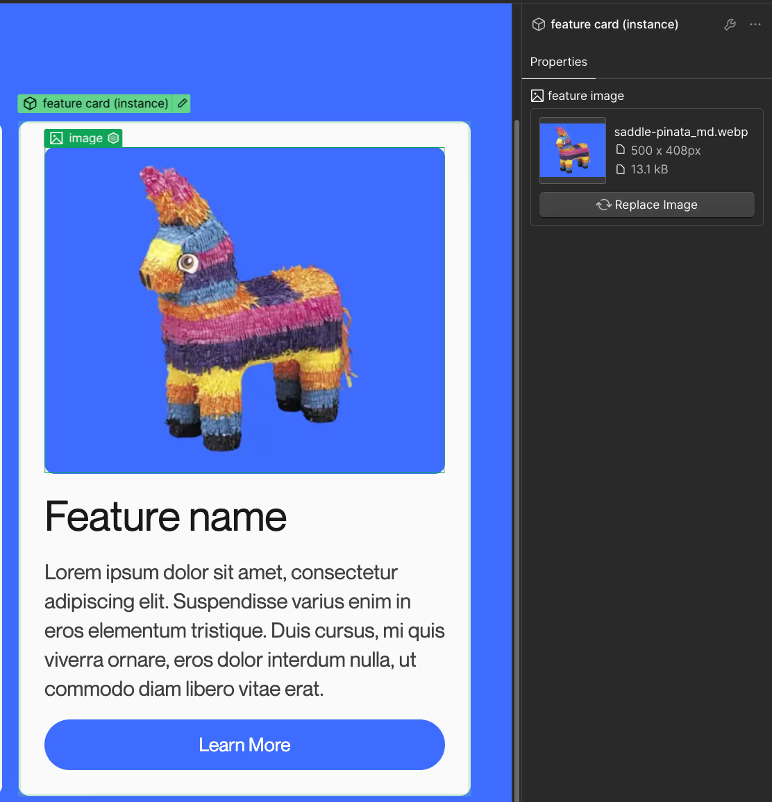
Now you’ve created your first property for your component. To see how it looks, go out of component editing mode, and click on your component. You’ll see a new item on your right panel called ‘properties’.
Similarly, you can create properties for headings, descriptions, CTA links or CTA text as well.
Okay, you now understand how components are created. You’ve also learned how to create properties to edit instances of components. But how do component slots fit in the picture? Let’s have a look.
Advanced Customization with Slots
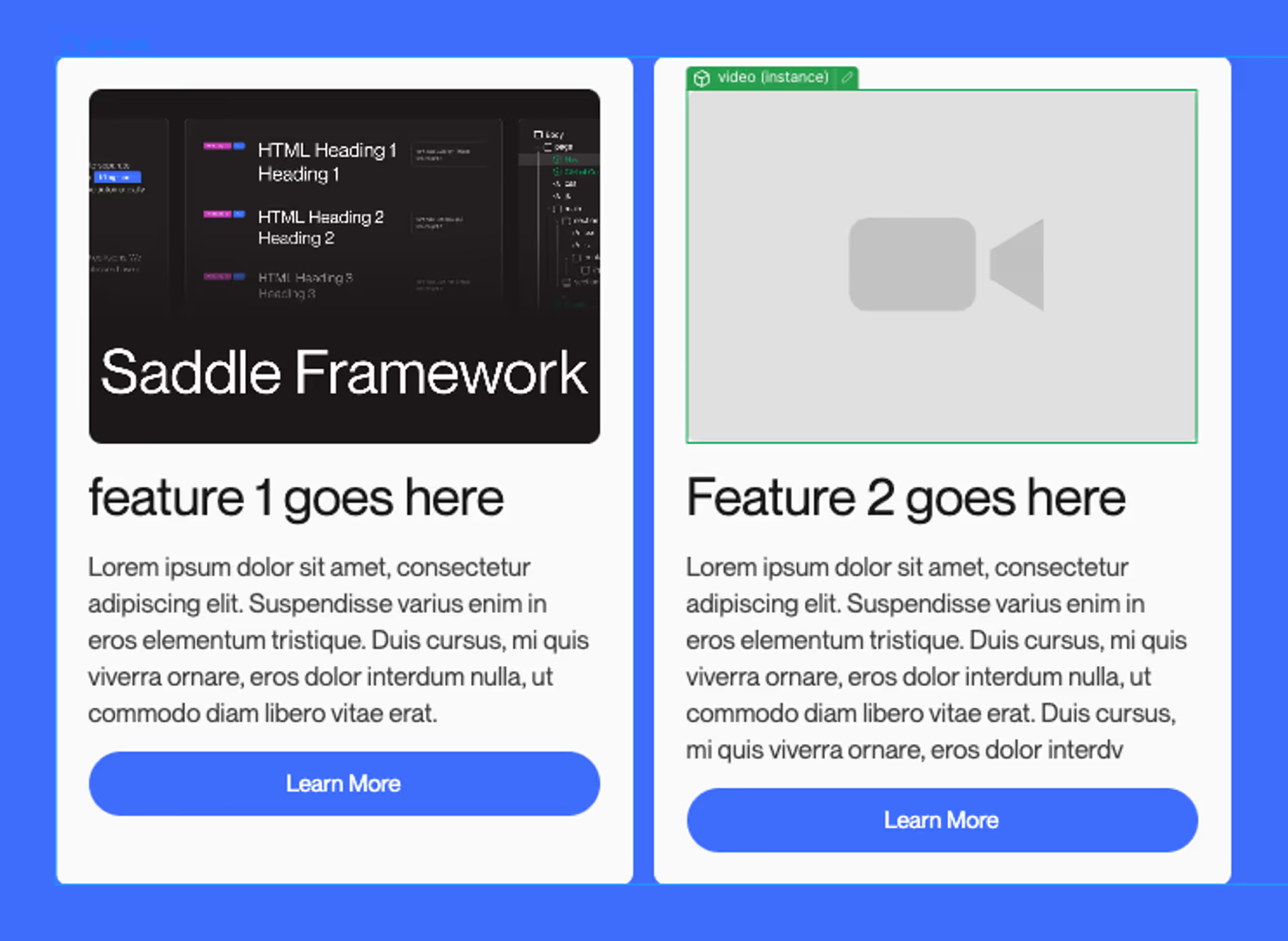
Suppose you want to add an image on one feature card, and a video on another. With just components, you’d have to add both elements on the card, create visibility properties for both, and create image and video properties as well to be able to make this work. Imagine doing that for all significant customizations.
With component slots, you only need to add 1 component slot in the place of an image, and now you can add images, videos, Lottie animations or even gifs for different features, without hindering the design or layout of other cards.
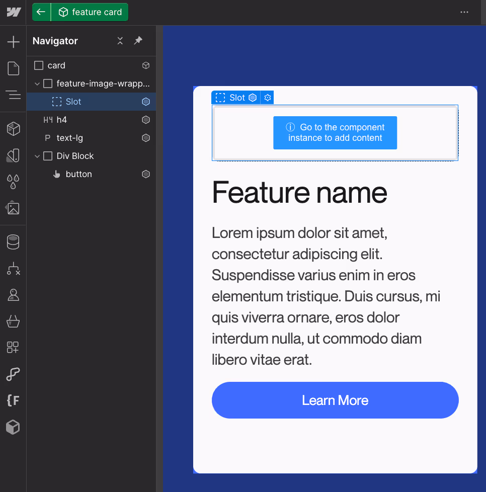
To add a slot, select the area in your component and choose "Slot" from the options.
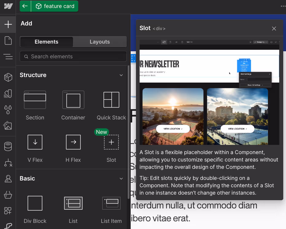
Once added, you can bring in different components under 1 component to create unique layouts as needed.
In our case, one card has an image component inside the slot, and another one has a video component.
Integrating CMS Data
For dynamic content, such as blog posts or product listings, integrating CMS data with your components and slots is important. Here’s how you can do it -
- Add CMS collection: Bring in the CMS component from the assets panel, and drop the component in the
collection item. - Select the Element: In the component, select the element you want to bind (e.g., an image or text block).
- Bind to CMS Field: In the right panel, click the purple link icon next to the property you want to connect. Select the appropriate CMS field from the dropdown menu (e.g., product image, title, description), and you are done.
For example, in the feature cards:
- The image source can be bound to a CMS field containing different feature images.
- The title and description can pull data from CMS fields for feature names and descriptions.
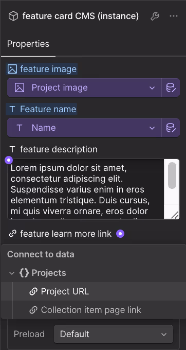
This will allow the feature cards to dynamically update based on the content stored in the CMS, making it easy to manage and update information across the site.
Using Webflow components in real projects
Now you know how components & slots work. But where can you use them in your or your client's projects? Here are some practical use cases of Webflow components -
1. E-commerce Product Cards
You can create reusable product cards by designing a single component with placeholders for key details like images, product names, prices, and "Add to Cart" buttons. This component can be duplicated and customized with specific product information, ensuring consistency across your entire catalogue.
2. Service Offerings Sections
You can design a component for service offerings that includes placeholders for icons, service titles, brief descriptions, and call-to-action buttons. You can also incorporate slots for supplementary elements such as case studies or client testimonials to provide more detailed information. This setup would allow for easy updates and consistency across all service descriptions.
3. Testimonial Displays
A CMS-connected component for testimonials with elements for client photos, names, and quotes can help you quickly populate the component with different testimonials while keeping the design uniform.
4. Team Member Profiles
You can also build a component for team member profiles, including placeholders for photos, names, job titles, and short bios. You can use slots to add personalized touches like social media links or unique project highlights.
What’s New in 2025: Properties and Variants
Webflow hasn’t stopped at Components and Slots. Over the past year, two new features - Properties and Variants - have made components even more flexible.
Component Properties
Think of properties as built-in controls for your components. Instead of digging inside the structure every time you want to make a small change, you can expose options right at the top level.
- Want a button label that your teammate can edit without breaking the layout? Make it a text property.
- Need to swap an image in a card component? Add an image property so it’s just a quick upload.
- Properties can be toggles, text inputs, or image slots - making life easier for both designers and content editors.
Component Variants
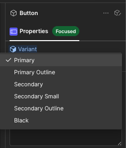
Variants let you keep multiple styles of the same component under one roof.
- Instead of building three separate button components (Primary, Secondary, Ghost), you create one button with three variants.
- Switching styles is as simple as choosing the variant from a dropdown.
- This keeps your component library clean and helps teams scale faster without duplicating work.
How this helps teams
Together, Components, Slots, Properties, and Variants form a system:
- Component = the reusable block.
- Slots = flexible placeholders inside it.
- Properties = quick top-level controls.
- Variants = style or layout options of the same block.
This workflow is a big win for growing teams. Designers can build once, editors can safely update content, and everyone works from the same consistent set of building blocks.
Making the most of Webflow components and avoiding common mistakes
When you are just starting out with Webflow components and slots, it's easy to overlook some details that can lead to inefficiencies or issues down the line. Here are some tips to ensure you get the most out of this feature and avoid common mistakes.
1. Plan Your Component Structure Carefully
Avoid creating overly complex components that try to do too much. For instance, don't make a single feature card component handle every possible layout or style variation. This can lead to difficulties in maintenance and updates.
Instead, create separate, simpler components for each distinct use case. Use slots to add flexibility where necessary, such as allowing for different types of content like images, videos, or text within the same component structure. This approach keeps your components easy to manage and update, ensuring a clean and organized design system.
2. Use Component Properties for Simple Customizations
Avoid using slots for every customization need, as they can add unnecessary complexity. Slots are best for significant structural changes or content variations.
Instead, use component properties for simple customizations, such as updating text, images, or links**.** For example, if you have a testimonial component, use properties to change the client photo, name, and quote text. This approach keeps your components lightweight and easy to manage, while still allowing for the necessary variations across different instances.
3. Maintain Consistency with Design Guidelines
Avoid letting each component instance have wildly different styles or layouts, which can confuse users and ruin brand consistency.
Stick to established design guidelines for each component. Use consistent styles for typography, colors, and spacing across all instances. For example, if you're using components for team member profiles, ensure that all photos are the same size and format and that the text follows a uniform style. This consistency enhances user experience and strengthens your brand identity.
4. Regularly Review and Optimize Components
Avoid neglecting components after they are created. Components can become outdated or inefficient over time, especially if your site evolves or new design trends emerge.
Regularly review and update your components to ensure they remain relevant and efficient. This includes checking for unused components, removing obsolete features, and refining designs to align with current standards.
5. Use CMS Integration for Dynamic Content
Avoid hardcoding content into components, especially if the content changes frequently, like blog posts, product details, or team members.
Use Webflow’s CMS integration to manage dynamic content within components. For example, instead of manually updating a blog post preview component, bind the component fields to your CMS collection. This setup allows the content to update automatically based on changes in the CMS.
Conclusion
By now, you've likely got a solid understanding of what Webflow components and slots are and how to use them in your projects. The more you play around with these features, the more you'll see how they can help you scale your projects faster and make updates easier. Keep experimenting, and you'll find that components streamline your workflow and make managing your site a breeze.
Another amazing feature of Webflow that you’d love is Webflow Variables. We’ve made a comprehensive guide on learning everything you need to know about variables. Give it a read!